Top Tip: Kern your characters upside down and back to front!
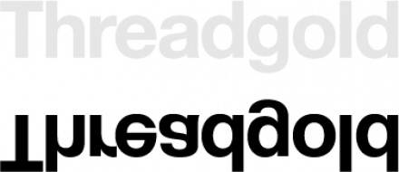
When I create any kind of logo with type, I find it easier to flip the word upside down before adjusting the letter spacing. It allows me think of the characters as shapes, without being distracted by actually reading the word.
The white space between each character is important to focus on – NOT just the shapes themselves. In fact, you should look at the white space as shapes too, as these are also actually part of the graphic you are creating. Don’t be scared to change the letter shape itself if you think the white shape in between is too big and ugly.
Happy Kerning!