Matching Colours
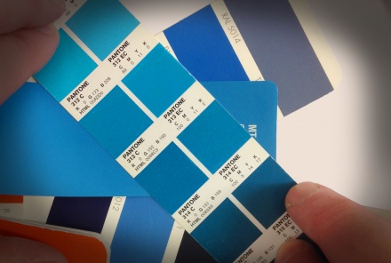
Don’t you just hate trying to match existing brand colours in mediums where they just don’t exist?
Earlier today I had to try and match my client’s corporate colours to ‘Vinyl swatches’, ‘RAL swatches’, ‘Pantone swatches’, ‘CMYK swatches’ and even ‘RGB colours’ (although RGB was relatively easy, as it’s got a huge colour model). The problem is, whoever chose the colours for their original logo didn’t take the time to think about how it might be used in a variety of situations – and in many cases there were no decent colour matches in the swatches I was looking at.
Unfortunately, most of the time it’s not an affordable option for the client to have bespoke colours made in specific mediums…so there’s no choice but to reluctantly choose something which is ‘sufficiently’ close; which means that their brand suffers and can be diluted to such an extent that it could start looking cheap or just plain wrong.
The lesson is a simple one: when you have a blank sheet of paper and a logo to design, the colour choices are key; not only for how they look now, but also for how they’re going to look when they’re reproduced in the future – in a variety of formats. Is the brand going to be mainly seen online, or is it also essential that it looks good on vans, or maybe site hoardings? Do your research!
Choosing your colours wisely and knowledgably at the start will help maintain consistency in your brand, whilst keeping it cost effective.


